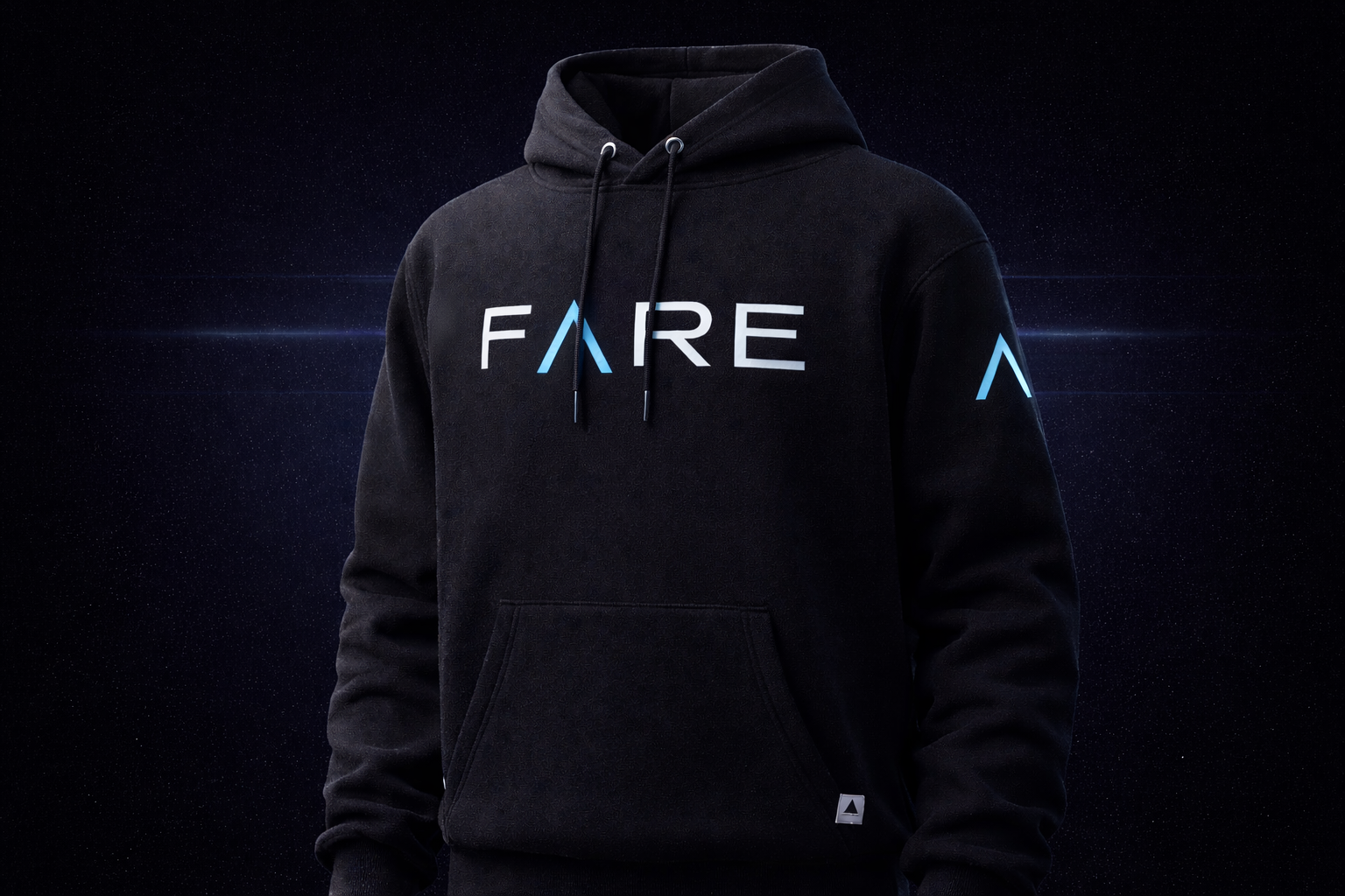
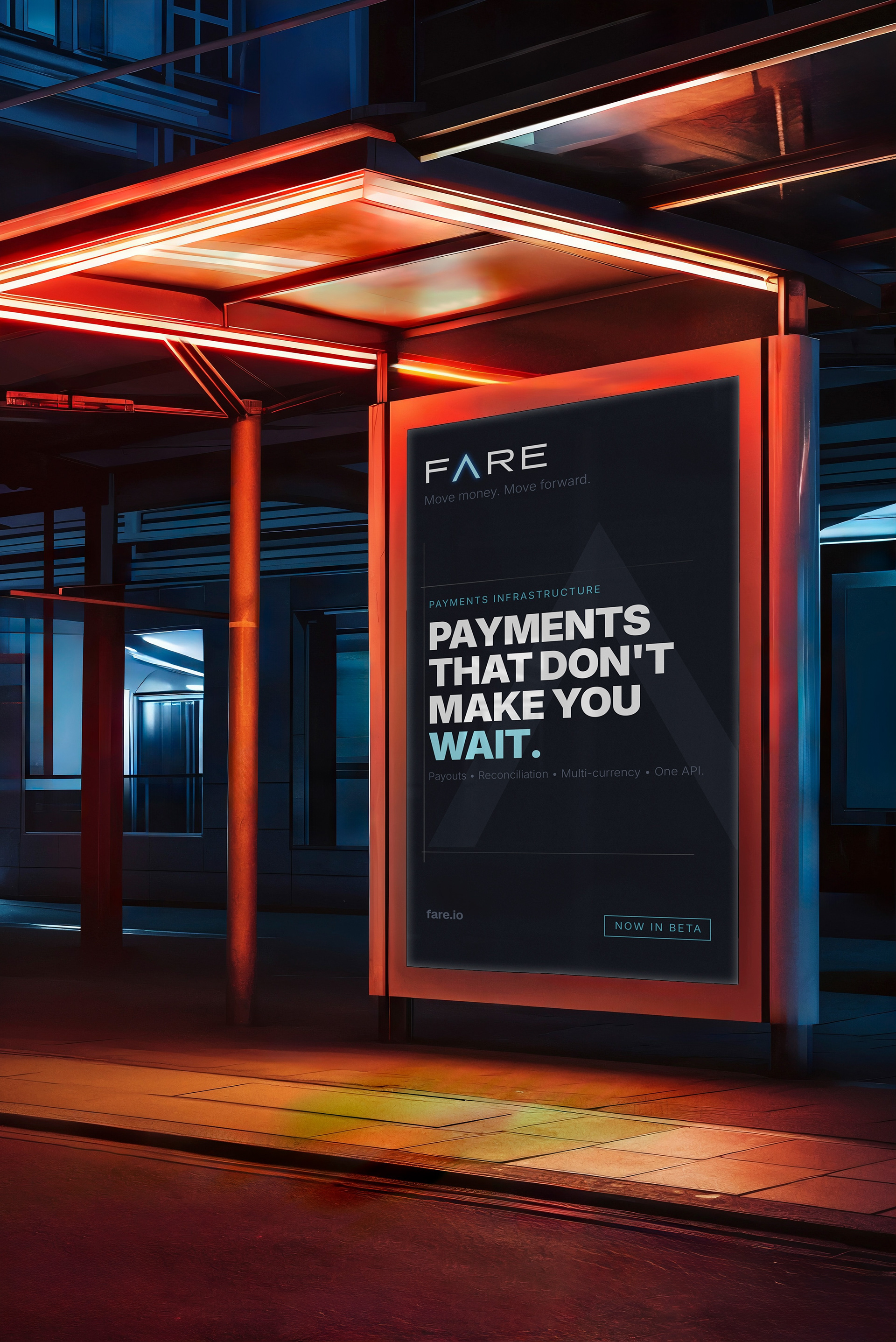
Fare is the cost of moving something. It’s also a measure of how well you did it. The simplicity of this brand is the economy of language and visual style. The dark background and angular precision allow the blue to light the way. The lambda A clarifies the function. When the solution owns the input, the process, and the output, it’s an operational level up.
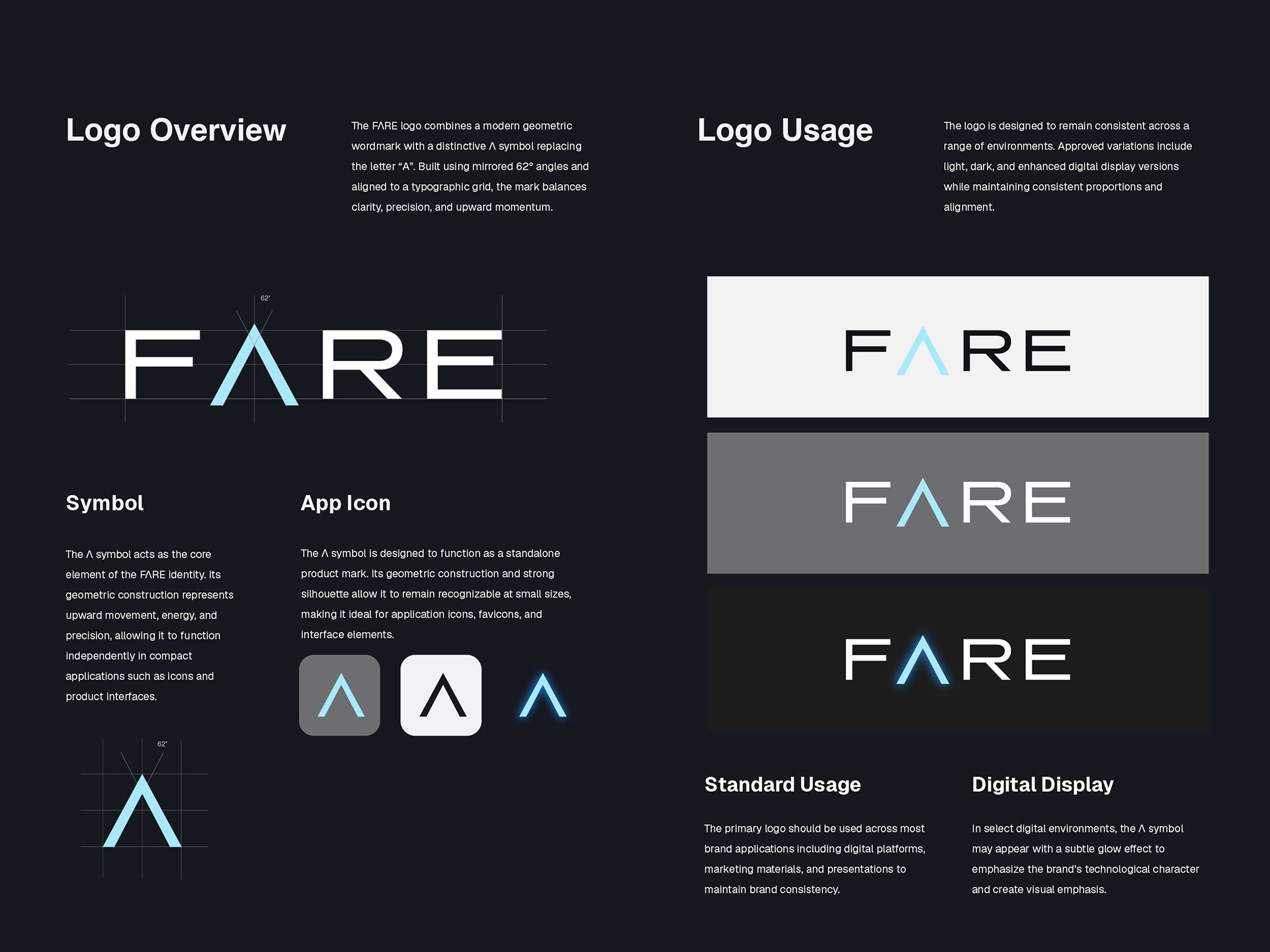
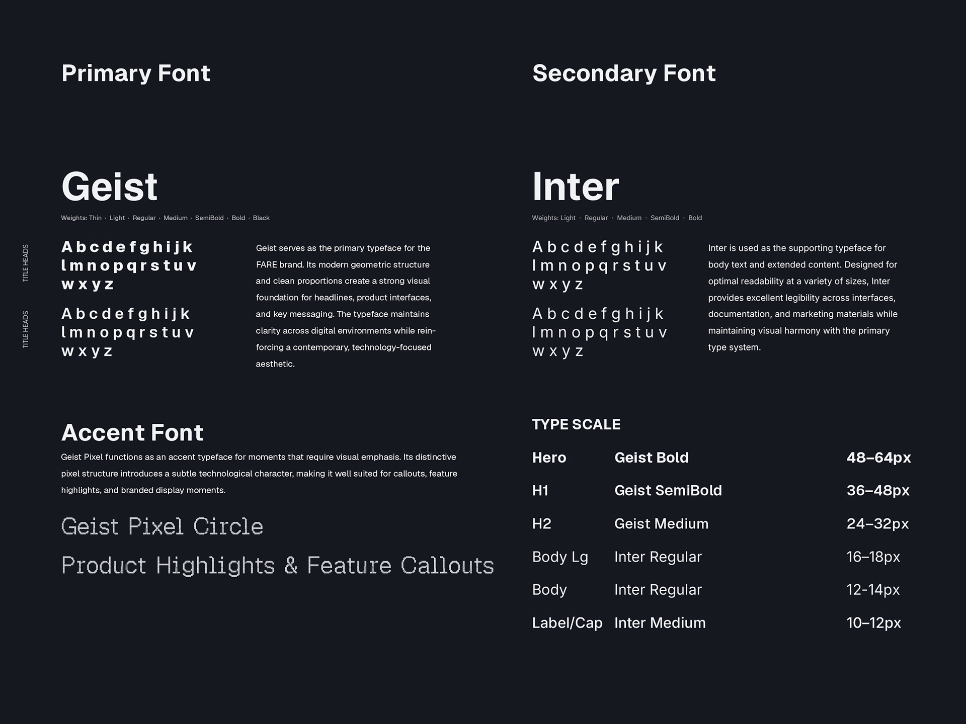
The system is built around one principle everything moves. The color palette stays dark and minimal so FARE Blue has room to do its job. The typography is geometric and structured because this is a product brand, not a lifestyle brand. The mark scales from a favicon to a building sign without losing anything. Every decision in this guide exists to make sure that wherever FARE shows up, it shows up the same way. Precise, fast, and already in motion.
Hope you enjoy!